
Website design is a complex, constantly developing field, that can do so much for your school. Because web design is constantly developing, many educational websites don’t seem to keep up with its trends. As a result, visitors often report experiencing issues like the website being slow, confusing navigation, lots of 404 errors, and outdated design. All of that leads to bad user experience (UX) that costs your school quality leads. Being progressive when it comes to web design is something that can support your school’s website and help you achieve greater goals. Let’s go through some key points on how to improve your website to attract more students.
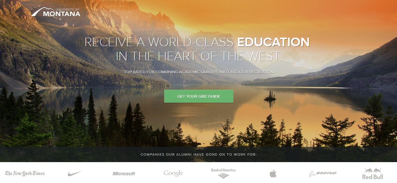
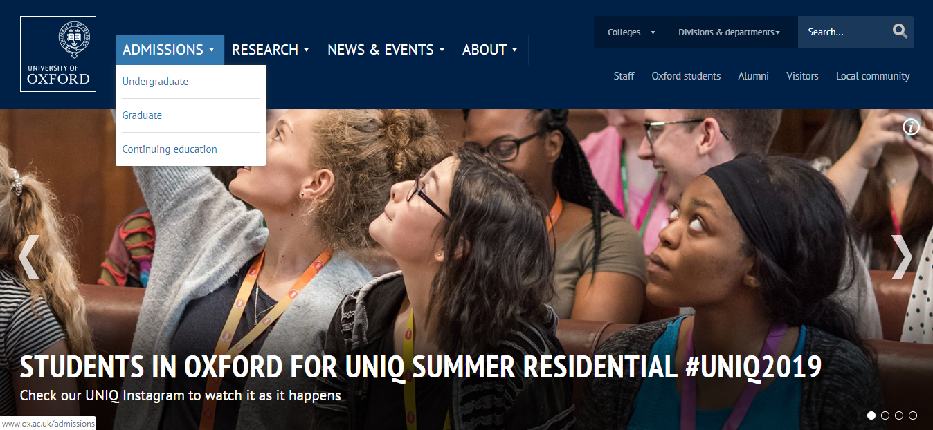
Bold and engaging visuals
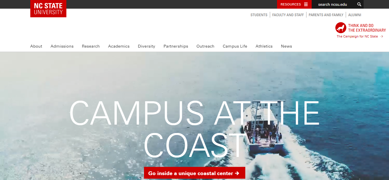
Quality visuals play a critical role in attracting a potential student’s attention to your website. Use bold and engaging visuals, especially on the home page. Greet your visitor with a stunning image. As they scroll down, help them connect with your school by showing them more specific visuals of different scenes from the university’s life.
Don’t use too much text
Another thing to help you improve your website to attract more students is not using too much text. Make sure you create a concise copy to represent the most important information about your school. Use a clean design with a clear statement of what your school offers. Create subheadings and divide the information into easy-to-consume sections.
Use bold fonts
Educational websites are not known for experimenting with fonts. But the ones that do, entice visitors to stick around and browse more. Don’t be afraid to experiment with different fonts, styles and even colours!

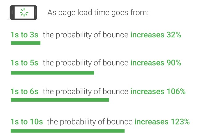
Optimise your website
The above-mentioned points are great, but their effectiveness in student recruitment could be reduced by a slow website. A fast loading page is one of Google’s main focuses for better UX, so having a website that loads for more than 10 seconds can slow you down the path of achieving your enrolment goals.
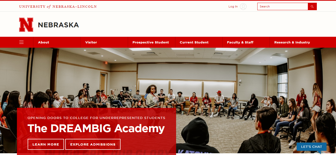
Clear navigation that’s colour powered
Poor navigation can be one of the reasons why your visitors aren’t converting on your school’s website. They probably couldn’t find what they were looking for or didn’t even realise you offer a programme that they’re interested in. To avoid losing potential students, your website needs to have clear navigation. Using colour for focus could be a great way to improve your website and attract more students.
Include quality videos
Because most people are visual learners, they typically respond very well to videos. There’s a reason why video is the most engaging type of content with good ROI, according to 78 percent of online marketers. Not only do videos increase engagement, but they also serve as a great tool to introduce the institution and staff, show student life, and help visitors visualise their experience as students.
A well-designed website that follows the points we discussed will certainly be more attractive to potential students. Making sure that you deliver the most relevant information about your school fast and in a structured way is crucial for retaining visitors and converting them into students.
Thanks for taking the time to read our blog post on improving your website design to attract more students. At faethe.marketing we have been helping schools to increase student enrollments since 2010. If you are looking to recruit the best matching students for your programmes with minimal cost and effort, feel free to reach out to us.